How do you see climate change?
Draw a quick picture / diagram (concept map) to show ‘My ideas about climate change’. You can do this in whatever way you want and you will be adding to it and developing it over the next few sections of the course. Don’t spend too long on this initial version.
Concept mapping is a way of representing ideas visually. It helps the learner make sense of the concepts and ideas and the relationships in a given topic.
Tips: if you’re not familiar with concept mapping, you might find these tips helpful.
- Use a large sheet of paper (A3 A2 or A1) and some colour pens – you will be adding to your map as we move through the sections
- It’s often helpful to write the ideas/ concepts on small bits of paper or post-its, so that you can move them about/ reorganise them as you develop the map
- Write the ideas first; then draw lines and arrows to show how they connect – creating a cause and effect web
- Don’t worry about getting it right or wrong (there are different ways to organise the concepts)
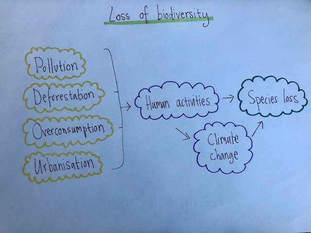
Here is an example of a concept map for biodiversity

The words in the table below might be useful to help start you off:
| greenhouse effect | consumption |
| fossil fuel | extreme weather |
| sea-levels | electricity |
| agriculture | effects |
| impacts | causes |
Don’t spend too long on this – a few minutes is plenty. When you have completed your first draft click on the next section button below.